- About Pims
- General
- User Interface: Web
- User Interface: Win
- Administration Tools
- Procedures
- Completion Management
- General
- Setup and Configuration
- Engineering
- Field Inspection with Mobile Apps
- Project Overview
- Handovers
- Commissioning
- Scanning
- Documents and Drawings
- Windows Client
- Reference Materials
- Document Control
- General
- Managing Documents
- Accessing/Searching for Documents
- Subscribing to a Document
- Creating New Documents
- Creating Missing Document as Contractor
- Creating New Document Revision
- Reserving Revisions
- Document Profiles
- Creating native files PDF rendition
- Adding Cover Page
- Uploading New Revisions as Contractor
- Initiating Internal Collaboration
- Initiating a Document Approval
- Editing a Document Approval
- Deleting, Voiding, Superseding a Document
- Moving Document Data Between Profiles
- Checking up on Documents' Status
- Distributing Documents for Information
- Distributing Documents Using Trays
- Sending Document Reminders
- Exporting Documents as Importable Datasheets
- Offline Archives
- Importing an MDR
- Modifying Import Data
- Processing Documents Submitted by Contractors
- Distributing Documents (older version)
- Documents Import and Export (older version)
- Sharing Documents and Correspondence
- Managing Interface Documents
- Redlining Documents
- Managing Reviews
- Initiating a Document Review
- Editing Review
- Sending Review Reminders
- Adding Reviewers
- Removing Reviewers
- Performing a Review with PDF files
- Performing a Review non-PDF Files
- Performing a Review with SharePoint
- Consolidating Comments
- Returning Reviewed Documents to Contractors
- Viewing Review Comments as Contractor
- Responding to Review Comments as Contractor
- Managing Review Response Replies
- Tracking Review Status
- 3rd Party Verification
- Status of a 3rd Party Verification
- Managing Correspondence
- Operations Phase
- Understanding Asset Domain
- Understanding Site Modifications Domain
- Managing Site Modifications
- Adding Documents to Site Modification
- Handing over Documents to Operations
- Managing Conflicts in Site Modifications
- Managing Distribution Setup in Site Modifications
- Concurrent Engineering - Alternative Way of Handling Site Modifications
- Managing Certificates
- Setup and Configuration
- Setting up a Contract
- Managing Distribution Setup
- Importing Distribution Setup
- Inquiring Distribution Setup Input
- Managing Correspondence Distribution Templates
- Managing Documents Distribution Templates
- Setting up Distribution Groups
- Setting up Email Templates
- Setting up Offline Archives
- Setting up SharePoint Integration
- Setting up SharePoint filename template
- Setting up Document Cover Page Template
- Setup and Configuration
- Miscellaneous
- Cost Management
- General
- Project Control Basis
- Contracts Management
- Change Management
- Personnel
- Progress Measurement
- Interfaces
- Reporting
- Windows Client
- Workflows
- Quality Management
- General
- ITP Register
- Surveillance Register
- Activity Register
- Activity Details Management
- Activity Plan
- Checklist Register
- Finding Register
- Export, Import, Copy or Move Activity
- Program Register
- Configuration - Domain
- Configuration - Global
- Risk Management
- General
- Add New Risk
- Risk Register
- Risk Details Management
- Risk Assessments
- Actions Register
- Action Details Management
- Risk Plan
- Risks Dissemination
- Export, Import, Copy or Move Risks
- Risk Dashboard
- Configuration - Domain
- Import Setup
- Risks - Risk Breakdown Structure
- Risks - Inputs Labels
- Risks - Show/Hide Functionality
- Risks - New Risk
- Risks - Fields Setup
- Risks - Dropdown Values
- Risks - Multiple Choice
- Risks - Keywords
- Risks - Lifting Functionality
- Assessments - Configuration
- Assessments - Project Borders
- Actions - Show/Hide Functionality
- Domain Settings - Notifications
- Configuration - Global
- Configuration - Roles
- Desktop legacy user guides
- Reporting
- HSE Management
- Preparation & Execution System (PES)
- PES Release Notes
- About
- Administration
- Asset and Plant register
- Case Register
- Checklists
- Compliance Activities
- Compliance settings
- Contact Lookup
- Courses
- Currencies
- Default Colors
- Definitions and abbreviations
- Delivery Lines
- Disciplines
- Documents
- Locations
- Packages
- Position
- Position Settings
- Punch Items
- Statuses Overview
- Sub Systems
- Subsystem Handover Status
- Tag Register
- Tasks
- Work Breakdown Structure (WBS)
- Digital Procedures
- Handover
- Meetings
- Organization
- Personnel On Board (POB)
- Portal
- Progress & Trending
- Project Assurance
- Service Request
- Work Process
- Planning & Scheduling
- Material Management & Logistics
- About Material Management & Logistics
- Stock & Materials
- Procurement
- Warehouse & Packing
- Shipping & Logistics
- Rental Items
- Tool Request
- Settings
- Work Preparation & Work Order
- Work Preparation Request (WPR)
- Work Order (WO)
- Work Order Settings
- Work Orders - Settings Overview
- Work Order - Default Attachments
- Work Order - Types
- Work Order - Requirements
- Work Order - Checkpoints
- Work Order - Mhrs Type
- Work Order - Trades
- Work Order - Phases
- Work Order - Keywords
- Work Order - Hold Codes and Job Status
- Work Order - Factor sets
- Work Order - Settings
- Work Order - Norms
- Work Permit (WP)
- Livening Up & Down Notice (LUDN)
- Overtime Request Register (OTR)
- Query Management
- Query Managment - User Guide
- Workflow Modules
- General
- Setup and Configuration
- Controls
- Action Tracking
- Concessions / Deviation Requests
- Interface Management
- Management Of Change
- Technical Queries
- Lessons Learned
Registers
Each workflow has it's own register listing all forms. By default the register is filtered on a domain, but if you click the "Show all" button in the header menu it will allow you to view all forms from all domains based on your permissions. The browser will also remember this setting, and by default enable it the next time you open the register. The setting is remembered across modules, so if you opt to not enable it in one register it will apply to the next register you open as well.
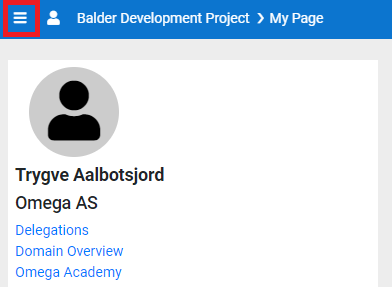
Accessing a register
You access a register through the menu. To open the menu you click the icon as indicated below:
Once this is clicked it will open the menu which will list all applications you have access to. To access a workflow register find the heading "Workflows", and all registers you have access to will be listed under here. You can also tag any application in the menu as a favourite, and opt to only show favourites.
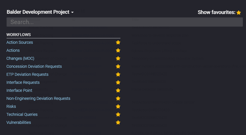
Click the register you want to access, and it will open the respective register.
Header Menu options

- Module Name - Name of the module register you are in.
- Add New - By clicking this button the add new form dialog will open. For details on add new form please refer to the module specific user guide(s).
- Tasks- Administrators and Superusers will have this option available, and from here you can:
- Raise Revision - Increment the revision of the form. See Common Functionality for further details.
- Make VOID - Void the form. See Common Functionality for further details.
- Reassign Signature - Reassign any open signature on the form. See Common Functionality for further details.
- Export- Under export you will find reporting options. Typically this will be:
- Data Export - An excel export containing all data fields for the workflow.
- Detail Report - A PDF export of the detail form for the workflow.
- Custom Reports - Any custom reports created for the workflow.
- Other Reports - A link to the application where reports created from the report builder is available.
- Dashboard - This will have a link to any available dashboards for the workflow.
- Settings - This will have a link to the settings screen for the workflow, and the audit log for the workflow.
- Common Filters - A pre-defined list of common filters to apply. By default it applies "Open" which lists all open forms you have access to. More details on filtering can be found further down below.
- Show All- By default the register will be filtered on domain, but by clicking this button you can make it show all forms for all domains depending on your permissions. The browser will remember your option between register, and either make it active or not depending on your last selection in a register.
- Not Active

- Active

- Not Active
- Free Text Search - A free text search allowing you to search for any input. This uses the search column of the workflow, so it will not typically search sub table data such as comments, attachments, etc.
Grid
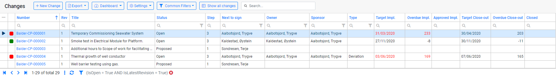
The grid lists all records you have permissions to. The number column is a hyperlink to open the detail form for the workflow. You can sort the grid by clicking a column header. Default the grid is sorted on "Number" as indicated by the blue arrow in the screenshot above. If the arrow is pointing up it is sorting Ascending, and if it is pointing down it is sorting Descending. You can sort on multiple columns by holding shift when you click the column header to apply sorting.
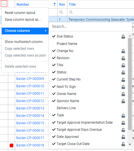
Clicking the 3 dots as marked in red above will open a pop-up with additional options for the grid. From here you can choose additional available columns to add into the grid, and/or opt to hide columns. The grid allows you to drag and re-order the columns per your preference. The browser remembers your layout choices, but you can also save the layout by clicking "Save column layout as...", so it is easily available to be re-applied. If you have any saved layouts they will be available for selection in this pop-up as well. If you click "Reset column layout" it will reset back to the default.
"Show multiselect column" will enable a new column to select multiple rows at the time. This can be used to exclude these rows from your result set. See "Footer Menu Options" for more details on how to exclude. It will also enable the copy options. Deleting records from the register is not allowed.
You can filter the grid by typing in the column filter input or by selecting values from the column filter lookup. More details on filtering can be found in the "Filtering" section of this user guide.
Footer Menu options

- Navigation - These arrows lets you change between pages. By default the grid is set to a page size of 25, but can be changed under "more options".
- Record Count - This will show what records you are currently viewing, and the total amount of records.
- More options - Clicking here will give you some additional options:
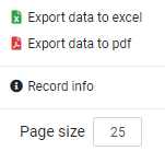
- Export data to excel - This will export data in the grid to an excel spreadsheet. It will export based on your applied filter.
- Export data to pdf - This will export data in the grid to a pdf. It will export based on your applied filter.
- Record info - This will show some additional information about the selected record such as who last updated it and who created it.
- Page size - This shows what the current page size applied is, and allows to change it. The browser will remember if you change it. It is not recommended to set this too high as it will affect load in time.
- Refresh - This refreshes the data in the grid.
- Filtering - Clicking the filter icon will open a pop-up with additional options:
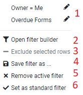
- Saved Filters - All your saved filters will be listed here.
- Filter Builder - Clicking this will open the filter builder to allow building complex filters. See further down below for more detailed information.
- Exclude - If you have enabled multi select column this will allow you to select multiple columns and then exclude them from the result set.
- Save Filter - This allows you to save the currently applied filter. So if you have applied filters from column filtering or free text search you can save the filter from here.
- Remove Filter - This removed the currently applied filter.
- Set Standard - This sets the filter as standard.
- Filter - This shows the currently applied filter.
- Remove Filter - This removes the currently applied filter.
Filtering
Common Filters
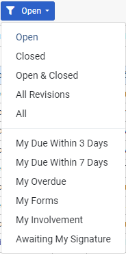
- Open (Default) - Shows all open forms.
- Closed - Shows all closed forms.
- Open & Closed - Shows all open & closed forms.
- All Revisions - Shows all open & closed forms including old revisions.
- All - Shows all open & closed forms including old revisions and archived data.
- My Due Within 3 Days - Shows forms that are due within 3 days.
- My Due Within 7 Days - Shows forms that are due within 7 days.
- My Overdue - Shows forms that are overdue.
- My Forms - Shows the forms which was created by the user.
- My Involvement - Shows any forms where the users have had a signature.
- Awaiting my Signature - Shows forms where the user is the next to sign.
Free Text Search

This is a free text box that allows users to filter on any information that appears in the register, e.g. if a user wanted to see all forms that contains a certain word in the title for the form, this can be typed in and filtered on.
Column Filters
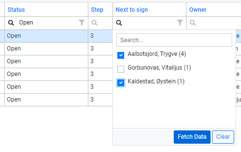
Column filters allows filtering in two ways, either by typing into the column filter input or using the filter icon to open a distinct list of available values to filter on. Please note that not all columns has the distinct list of values available as they typically are not grouped values, such as Title and Number.
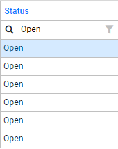
In the above example the user has typed in "Open" in the column filter input, and the result set is now filtered on Status contains "Open".
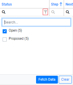
In the above example the user has clicked the filter icon as indicated by the red square, and then selected "Open" from the available distinct fields in the list. The result set is now filtered on Status in "Open". If we also click on "Proposed" it would be filtered on Status in "Open" or "Proposed".
Filter Builder
Every filter that has been applied to the result set will appear in the filter builder when opened. Refer to the "Footer Menu options" on how to access the filter builder. The example below shows how the filter builder would look with the default filter "Open" applied and column filter for Status in "Open" or "Proposed".
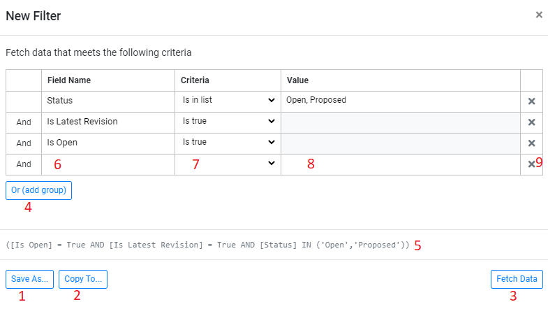
- This allows to save your filter for easy access to it later on.
- This allows to give the filter a name, and then copy/share to another user.
- By clicking this button you will apply the filter.
- By clicking this you can add an "Or" group to your filter.
- This shows the formatted filter.
- By clicking here you get a lookup of available fields to filter on.
- Here you select what you want to filter on. Available criterias varies on what type of field you are filtering on. A text field would have more options to filter on compared to a boolean (true/false) field.
- In here you type the value to filter on when applicable. As you see from example above there is no need to input a value if you are checking on the criteria "Is true".
- If you click the "X" you remove the row.
Sharing Filters
You can share filters either by using the "Copy To" option in the filter builder, or you can copy the URL. The URL will have the filter appended so you can easily share any applied filters that way.
Coloring
The date and overdue columns of the register are color coded to reflect the status of the record in regards to the target date, and there is also a stand alone cell with the color code to easily identify status of records. In the list view this is shown with a label.
- Green – The form has more than 3 days before the target date is reached.
- Orange – The form has three days or less before the target date is reached.
- Red – The form is overdue and target date has passed.
- Black – The form is not currently tracking against any target date.